2021-2023

MGID Ads Redesign

MGID is a high-load service that delivers ads to millions of users in multiple languages, creating thousands of ad campaigns every day. I was honored to lead its full redesign, improving usability and visual consistency across the product.
I’m excited to share an overview of this project and take you behind the scenes of the design process. If you’re mainly interested in the design decisions and results, you can skip ahead to Design Implementation & Results
Background

We aimed to improve existing user flow, and create a new design that enhances user experience, increases task success, and minimizes backend changes.

Metrics
Initial design
Average time on task
16.28
Average success rate
65%
Average SEQ (1 very difficult - 7 very easy)
3.4
Results of UX benchmarking study for campaign creation flow

Our team conducted a UX benchmarking study before redesigning the product, in order to have a basis for comparison with the updated design and to identify and prioritize existing usability issues. As a result we gathered our baseline metrics and discovered that new users had difficulty completing major flows.

My Role

As the lead product designer on this project, I worked closely with a product manager, a UX writer, and a team of developers to ensure that the user experience was prioritized in every decision made.

Highlights from my work leading the MGID ads redesign:

  • Lead the redesign of the MGID ads through the discovery, design, development, and delivery stages of the user-centered design process
  • I conducted discovery research, facilitated workshops, conducted user interviews, and built customer journey maps.
  • Analyzed research data, identified key user needs and product opportunities, and validated design decisions through UX research and usability testing.
  • Considering product limitations and external/internal technical dependencies produced user-centered UX design solutions through wireframes, visual designs, site maps, and prototypes.
  • Established a UI for a core desktop client through collaboration with product managers, UX writers, researchers and engineering.
  • Took part in defining an actionable strategy and roadmap quarterly and developed design decisions for product growth.
  • Partnered with designers and engineering to facilitate a design system that onboards faster, begins to work more quickly, and reduces confusion among designers
Working remotely during COVID-19: pajamas on the bottom, professionalism on the top
Research

We needed to assess how people currently create campaigns and identify potential improvements to enhance the user experience.

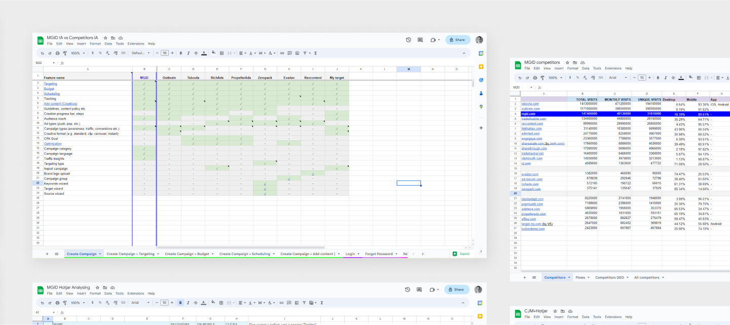
In doing so, we conducted the following activities:

  • Competitor audits

    We surveyed experts and used SimilarWeb Pro to find our top 10 competitors, compared their information architecture to MGID's, identified areas for improvement, and found common trends.
  • Heatmap analyses

    We analyzed Hotjar data and user session recordings to confirm key assumptions and uncover new insights.
  • Facilitating workshops

    Together with the product manager, we held workshops with subject-matter experts grouped by user type (affiliate agencies, media buyers, and brands). Each group mapped customer journeys and uncovered key pain points and opportunities.
  • User interviews

    We also interviewed affiliate agency users to validate additional hypotheses and gain a deeper understanding of their workflows.
Research findings in summary tables
Wireframes & Prototyping

After establishing a clear direction for the design, we created wireframes and updated user flows.

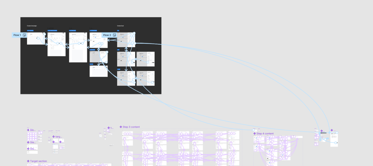
After creating the designs, I presented them to both users and internal stakeholders for testing and feedback. Using their input, I narrowed down the options and proceeded to update user journeys.

Clickable Prototype
Creation campaign prototype interconnections
Design system integration

We created a library of ready-to-use components for the new product interface, streamlining development and improving efficiency.

The platform lacked a consistent design system, which slowed down both design and development, complicated collaboration, and caused usability and visual inconsistencies, leading to UX and design debt.

According to Anja Klüver from Prospect, who collaborated with the company’s UX Centre of Excellence, real product data showed that applying design thinking and a design system could make projects 30% faster and 30% cheaper.

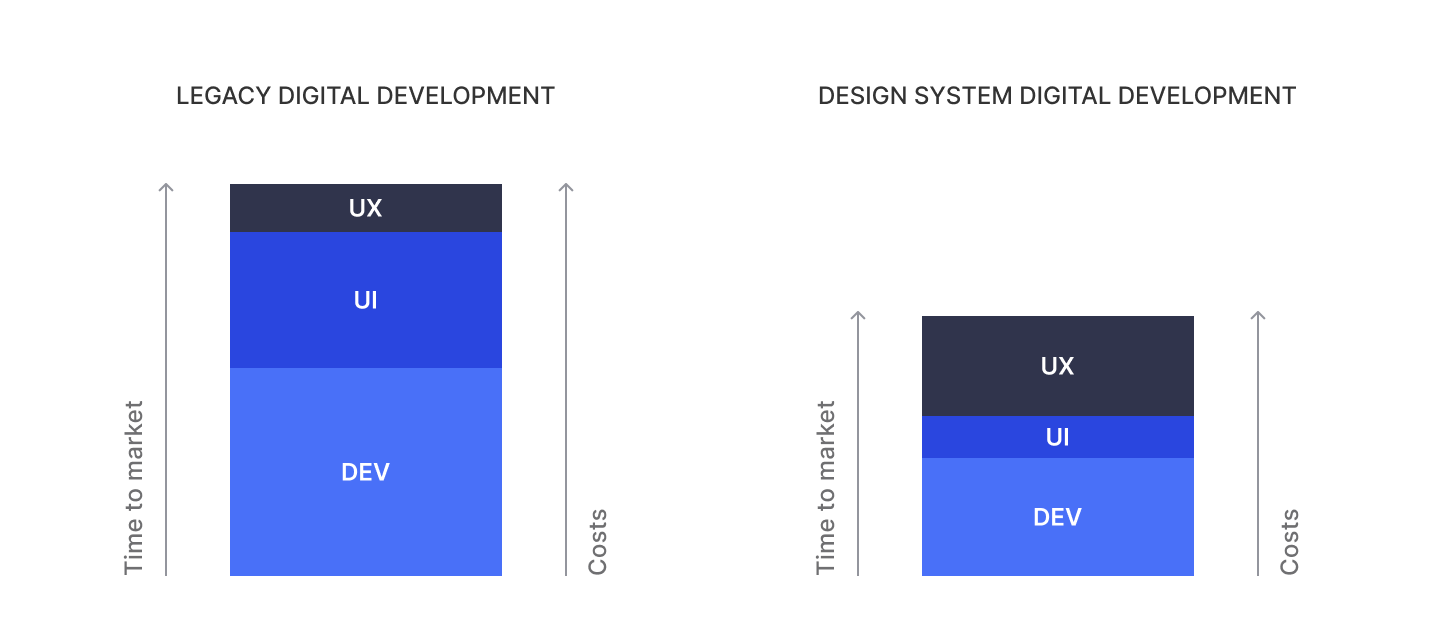
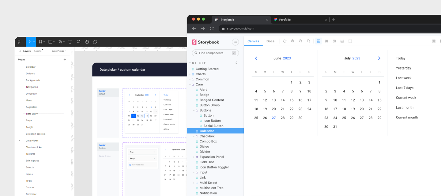
To address these challenges, we created the MGID design system, which has successfully improved various aspects of our platform. The key benefits of implementing this system included:

  • Reducing the learning curve for users by offering predictable and consistent interfaces.
  • Providing more time for exploration, discovery, user research, and thoughtful consideration of complex flows.
  • Enabling scalability for both design and front-end areas in the future.
  • Achieving up to 50% time savings on common patterns and user journeys.
  • Increasing product development efficiency and efficacy by up to 25%.
  • Building functional prototypes up to 25% faster.
  • Streamlining the onboarding process for new designers and developers, resulting in time savings.
Calendar component in Design System and in Storybook

By implementing the MGID design system, we took a significant step towards improving the overall quality and efficiency of the platform, fostering better collaboration between teams, and enhancing the user experience for our valued users.

Improvements / Campaign Performance

Our central objective in redesigning the Campaign performance page was to simplify user understanding without compromising on existing functionality and successful integration of new features.

Updated “Campaign performance” page interface

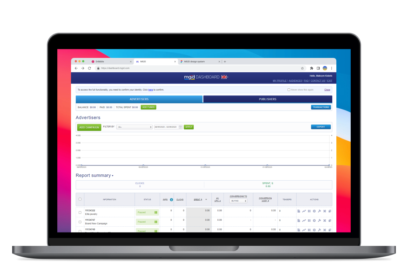
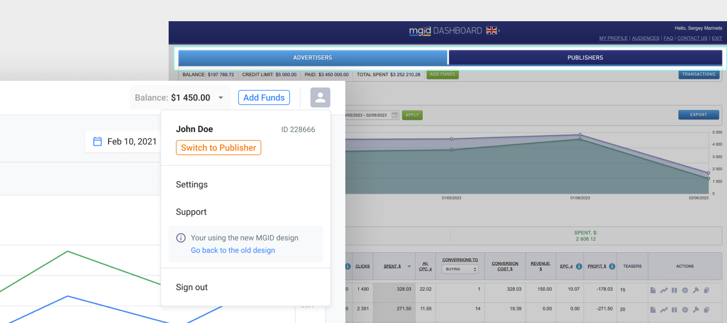
To enhance page clarity, the first step was removing the large Advertiser/Publisher switch and relocating it to the user profile.

Updated user profile dropdown with Advertiser/Publisher switch

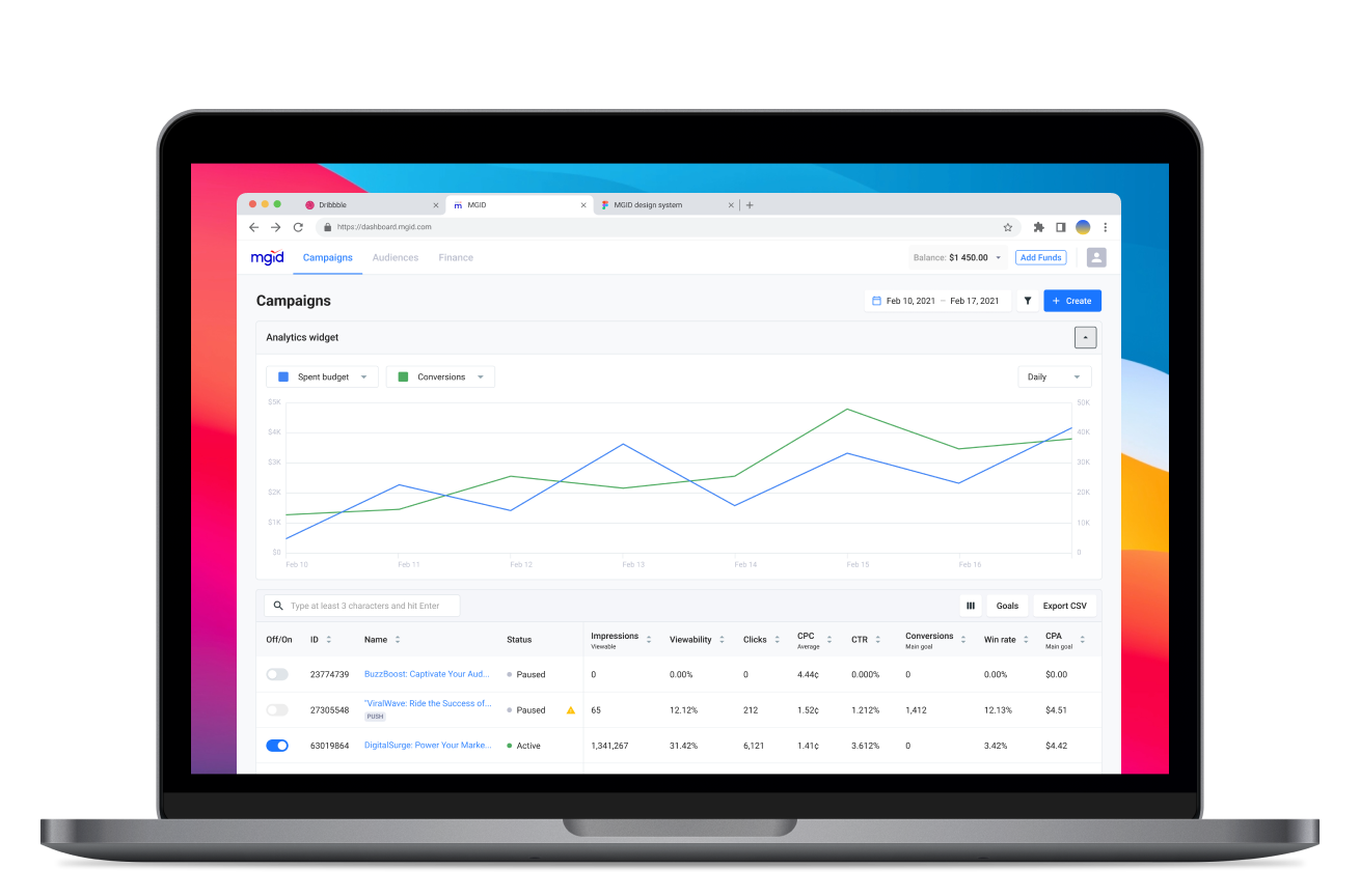
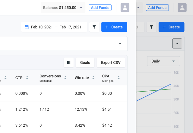
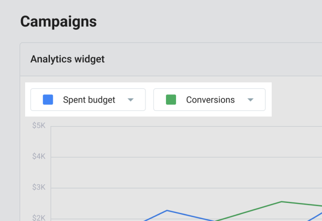
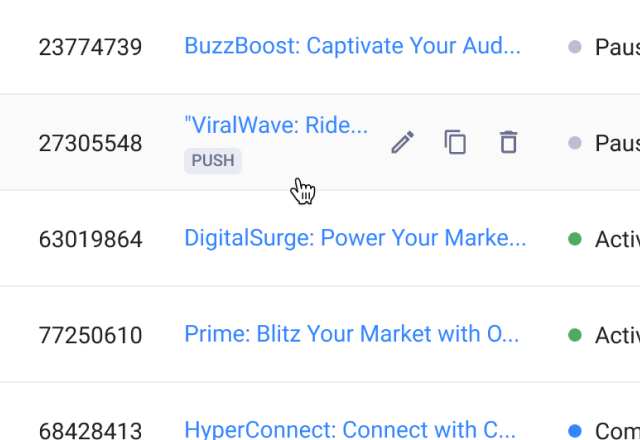
Following that, I focused on improving the Campaign performance page's functionality with the following enhancements:

  • Users now have the option to collapse the graph, based on research indicating their preference for focusing on the data in the table.
  • Collaborating with a product owner, I enhanced the graph's functionality, making it dynamic and enabling users to select preferred metrics for comparison.
  • In pursuit of a smoother user-flow,  I restructured the actions for each campaign in the table, concealing secondary actions under hover and relocating "Statistics," "Optimization," and "Ads" to the campaign page.
Improvements / Ads Creation

UX research found most users, especially affiliates, create multiple variations for each ad during a single session by combining different text and image options for optimal conversions.

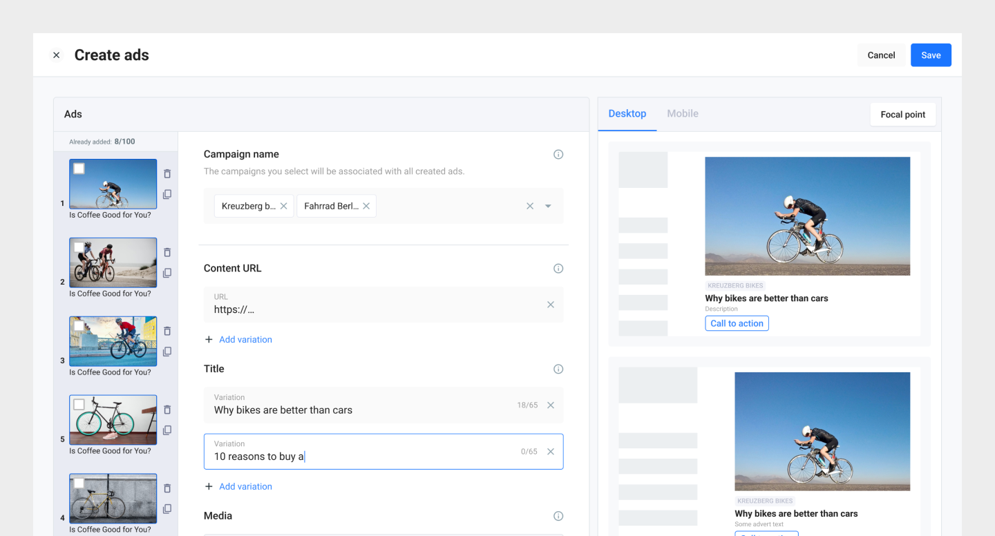
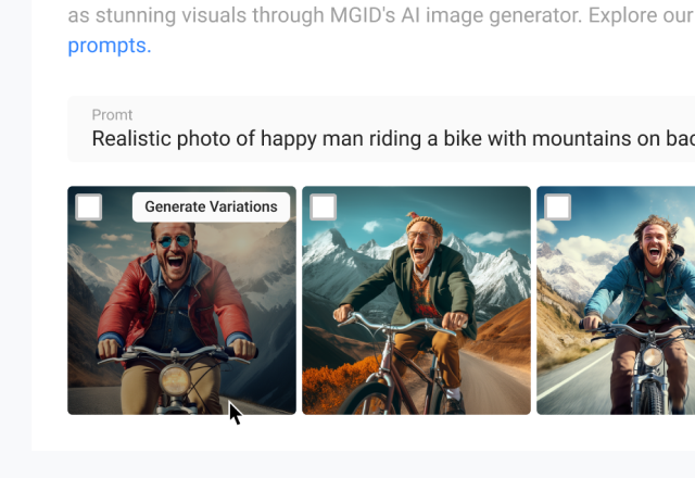
The previous interface slowed this process, requiring users to redo the ad creation flow for each image-text pair. In order to streamline the ad creation process we've introduced variative ad creation. Now, a range of text-image pairings are auto-generated, substantially enhancing efficiency and fostering smoother workflow.

Updated Ads creation interface with ads variations

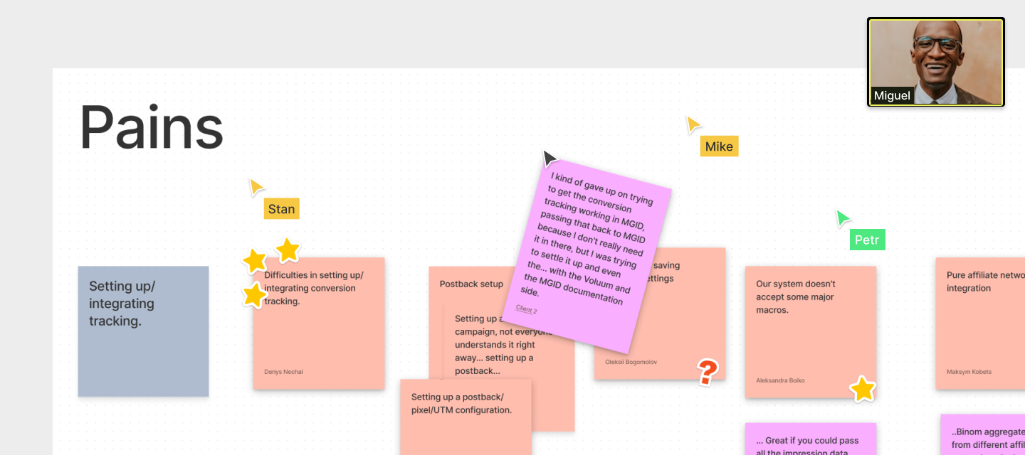
The research findings have also revealed additional challenges that users come across during the process of creating ads:

  • Ambiguities in certain features (Category Selection, Teaser Rich, Read Metadata)
  • Unclear image focal point configurations and size adjustments.
  • Absence of a distinct preview for various image formats.
Significant usability challenges within the previous Ads creation interface.

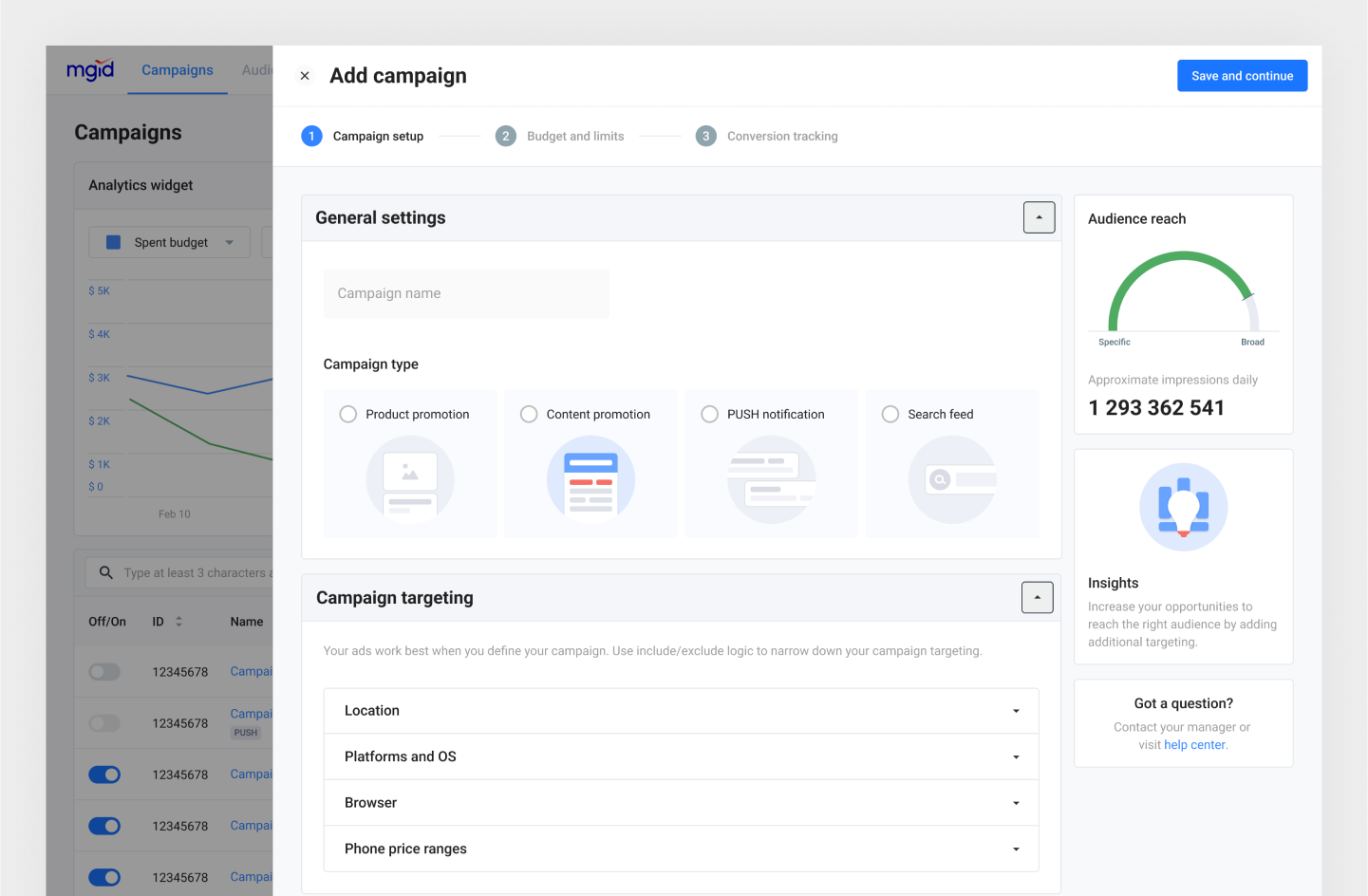
In order to address these issues, I directed my efforts towards enhancing the flow of ad creation by implementing the following improvements:

  1. To streamline ad creation, we relocated CPC selection to the “Limits & Schedule” in campaign level. This allows users to customize it for individual ads in the ad interface.
  1. We moved the focal point settings to a dedicated screen and introduced a preview of all available formats for the chosen teaser on the ad edit page. This empowers users to instantly view how the teaser appears on the content page and easily fine-tune the image center for various formats.
  1. We implemented time-saving functionalities such as Title Recommendation and AI-generated images, and eliminated redundant fields effectively streamlining the Ads creation process.
Improvements / Campaign Creation

My objective was to streamline the campaign creation process for users. Research revealed notable user pain points, including complex form fields, confusing errors and the inability to save drafts in case of unexpected issues.

To address these, I initially focused on major usability concerns:

  • Simplified the campaign creation into three distinct steps, grouped settings by type, and incorporated a stepper with step names for better progress tracking.
  • Introduced synchronous progress saving and inline input validation to prevent data loss due to connectivity issues or accidental browser tab closures.
  • Enhanced user comprehension by relocating errors from the header to relevant fields and refining error messages with the assistance of a UX writer.
Updated Campaign creation flow

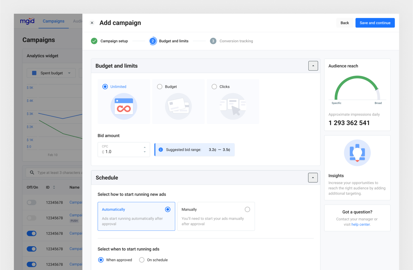
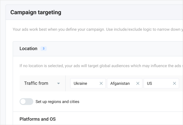
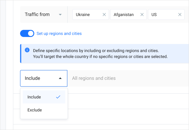
Based on user interview feedback, particularly concerning targeting complexities, I undertook the following measures:

  • Overhauled the layout for easy scanning and simplified targeting settings, making the process more intuitive and straightforward.
  • Enhanced user guidance by offering detailed explanations and replacing ambiguous icons with clear text labels for the include/exclude options.

Furthermore, I fine-tuned the layout and removed any unnecessary elements, achieving this through the subsequent actions:

  • Eliminated redundant fields, such as the category field, by automating data collection.
  • Segregated traffic insights to a separate page, recognizing that users rarely needed this information during campaign creation.
Improvements / Campaign Optimization

I had quite a bunch of meetings with the product manager and backend developers, mainly because the way we improved the interface depended a lot on how the backend was set up.

Optimizing an advertisement campaign involves an ongoing process of closely tracking statistics, analyzing real-time data, and comparing it with the goals, then turning off non-performing sources and adjusting the CPC to more effective ones in order to bring the actual values ​​closer to the target value. As you can see, it is quite time-consuming and takes a lot of manual work.

Updated campaign optimization page

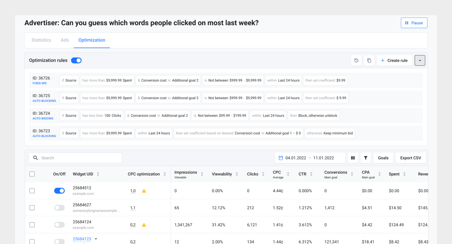
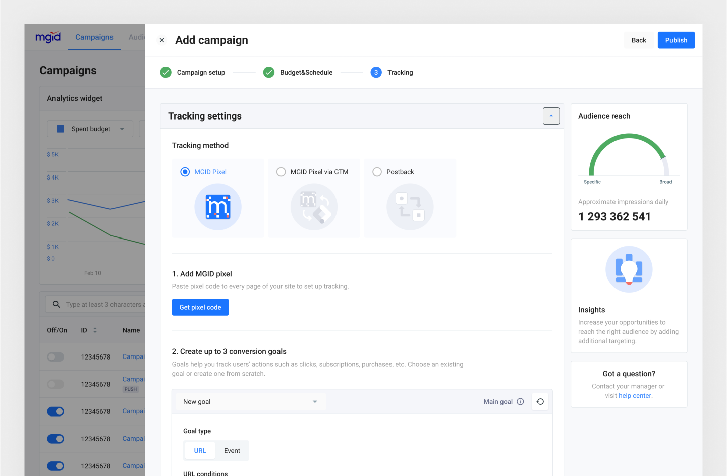
To make life easier, MGID introduced rule-based optimization for advertisers. Automation that saves time and resources and also removes human mistakes and sometimes extra waiting time from people involved in the management process. Interestingly, though, only 3% of advertisers are actually using this type of optimization.

Subsequent interviews highlighted that the extensive tracking settings in the campaign creation process, necessary for rule creation, were acting as a barrier to user engagement with automation. As I had already reconstructed the tracking setup in the campaign creation flow, my aim was to enhance the user experience without extensive backend modifications. This was achieved through the following strategies:

  • Improving the discoverability and refining the layout of automatic rules settings.
  • Reconfiguring the column order based on insights gathered from interviews.
  • Relocating goal settings to filters for a more streamlined experience.
Results and Next Steps

In mid-April, we successfully launched our internal testing involving subject experts. Not only customers feedback was mostly positive, but nearly all participants smoothly navigated the user journey autonomously, without necessitating support.

Part of the feedback received from subject experts.

For the internal testing phase, we meticulously selected 7 participants for both usability testing and usability interviews, allotting 1.5 to 2 hours per session. Our approach encompassed a blend of testing and interviews, serving two purposes:

  • Task completion evaluation: We assigned tasks for independent execution, closely observing participants' actions and seeking their insights.
  • Post-task experience assessment: We conducted personal interviews to gain deeper insights into participants' experiences following task completion.

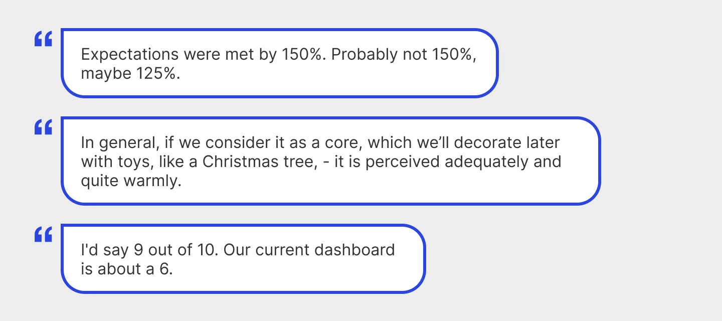
Users think that the platform is more user-friendly, which increases the satisfaction of dashboard use. We improved many things, like launching ads after approval, clearer moderation feedback, the errors have become more humane, and they appear in the run time. According to users' feedback, we have improved our platform in following:

  • Increased the efficiency of the platform and campaign management speed
  • Reduced complexity, errors, problems, and pain points
Metrics
Initial design
Updated design
Average time on task
16.28
14.13
Average success rate
65%
96%
Average SEQ (1 very difficult - 7 very easy)
3.4
5.6
Results of UX benchmarking study for campaign creation flow

At the same time, we have found additional insights and launched a series of product improvements based on research feedback. However, the project's scope extends beyond these accomplishments. The next stages include:

  • Addressing identified issues.
  • Conducting a second round of testing with external participants, our clients.
  • Undertaking quantitative research.
  • Launching a beta version of the updated platform.

During my involvement in the MGID Ads redesign, I've amassed pivotal insights that now underpin my design philosophy. Effective communication, spanning across teams and departments, stood as a central pillar of our achievements.

One Year Later

A year after the redesign launch, I asked the Head of Product for feedback and any metrics he could share. He noted that the redesign was well-received overall and led to a significant reduction in the support team’s workload.

Read this next